一般来说,css布局有好几种,我们来看下比较常见的 左右布局 和 左中右布局。
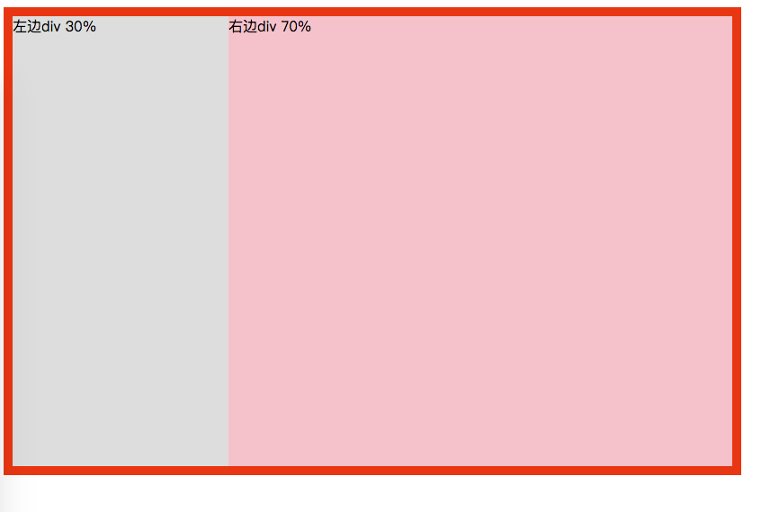
左右布局
例如相对固定的,给出了百分比,用 float:left 。(注意用了float,需要在其父元素加上 clear:both)。
1 |
|
左边固定宽度,右边自适应宽度,那么右侧的宽度由其内部的文档流决定。
左侧 DIV 设置 float 属性为 left,右侧 DIV 设置 margin-left 属性等于或大于左侧 DIV 宽度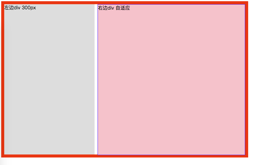
1 |
|
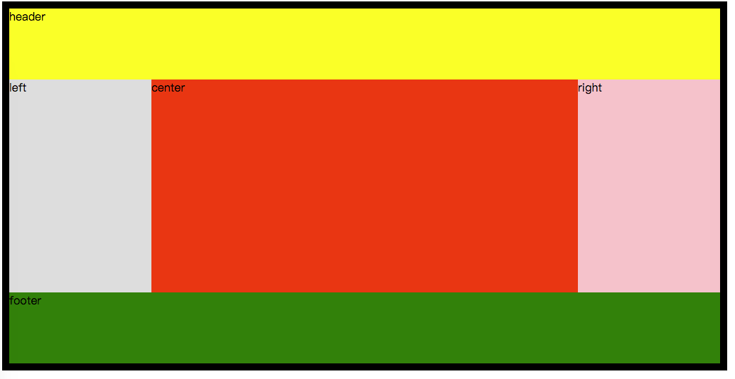
左中右布局(中间均为自适应)
一般如下图(float + margin)
1 |
|
注意:center是放在最后一个div
还有(float + position)
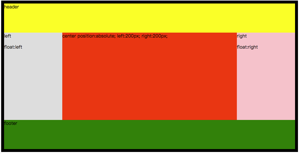
1 |
|
水平居中和垂直居中
水平居中
情况如下
1、行内元素
将行内元素,包裹在一个 块级元素 的父级,再在设置 父级 text-algin:center。
1 | .parent{ |
2、块级元素
1 | div{ |
3、多个块级元素
将该元素设置为 display: inline-block,并且将其 父级 设置text-algin:center。
1 | div{ |
4、一行行内元素
将该元素的高度与其 父级 的高度设置一样。
1 | .parent{ |
5、多行行内元素
将其 父级 设置display: table-cell,vertical-aligin: middle。
1 | .parent { |
垂直居中
1、有 高度 和 宽度(width:100px;height:100pxl;)。
1 | div{ |
2、有 高度 和 宽度(width:100px;height:100pxl;)。
1 | div{ |
3、未知 高度 和 宽度。
1 | div{ |